The Colors That Lead to Gold: Why Your Palette Matters More Than You Think
When it comes to marketing, most businesses focus on the message. The offer. The headline. The call to action. But there’s something working just as hard behind the scenes: your color palette.
Before someone reads your email, clicks your ad, or scrolls your website, color has already influenced how they feel. It shapes perception in seconds. And in marketing, seconds matter.
Around this time of year, we hear a lot about luck and pots of gold. But in marketing, results don’t come from luck. They come from strategy. And one of the most overlooked strategies is how you use color.
If you want your campaigns to convert, your visuals need to be just as strategic as your copy.
Understanding Color Psychology
Color psychology is the study of how colors affect how people think, feel, and behave. In marketing, it plays a critical role in three key areas:
- How customers emotionally respond to and remember your campaigns
- What message your visuals communicate about your offer
- How color influences clicks, conversions, and buying decisions
Choosing colors because they “are your favorite” isn’t enough. In marketing, color must guide attention, create emotion, and drive action.
Color Impacts How Your Offer Is Perceived
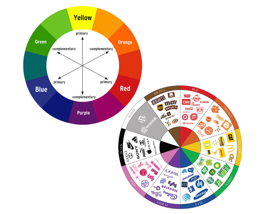
Colors influence how customers judge value and quality, often instantly. A sleek neutral graphic can feel premium and luxurious, while bright, saturated colors feel energetic and playful.
Even packaging colors in ads or product photos shape perception. A green juice bottle appears healthier, while a matte black smartwatch instantly feels more high end.
Before a single word is read, color has already set expectations, and that first impression can either build confidence or create hesitation.
The Psychology of Each Color
Understanding what each color communicates helps you convert more effectively. Here’s how colors influence customer behavior.
Pink: Playfulness and Approachability
Pink often communicates warmth, friendliness, and creativity. While traditionally associated with femininity, modern marketing uses pink to signal playfulness, innovation, and bold personality. The shade you choose helps determine whether your message feels playful, elegant, or bold.
In marketing, pink is often used for:
- Beauty and skincare products
- Fashion and lifestyle brands
- Youth-focused campaigns
- Bold, modern product launches
Red: Urgency and Action
Red is bold, intense, and impossible to ignore. It increases heart rate and creates a sense of immediacy. It signals act now. However, too much red can feel aggressive. It works best as an accent color when you want attention on a specific action.
In marketing, red is often used for:
- Clearance sales
- Limited time offers
- Important announcements
- Call to action buttons
Orange: Energy and Encouragement
Orange blends the urgency of red with the friendliness of yellow. It feels enthusiastic without being overwhelming. It says this is exciting, come try it. Orange is especially effective for brands that want to feel approachable and action oriented.
In marketing, orange is commonly used for:
- CTA buttons
- Sign up prompts
- Navigation highlights
- Promotional graphics
Yellow: Attention and Optimism
Yellow grabs attention quickly. It radiates positivity and warmth. It communicates this is uplifting and energetic. Used sparingly, yellow creates contrast and draws the eye exactly where you want it.
In marketing, yellow works well for:
- Highlighting key information
- Drawing attention in ads
- Background accents in social graphics
- Youth focused campaigns
Green: Growth and Balance
Green feels stable, natural, and reassuring. It’s often associated with health, wealth, and sustainability. It tells customers this is safe. This is smart. This is sustainable. Green is powerful when your offer revolves around improvement, progress, or long term value, making it one of the most versatile colors in marketing strategy.
In marketing, green is effective for:
- Wellness and lifestyle campaigns
- Financial services promotions
- Eco conscious messaging
- Success or growth themes
Blue: Trust and Reliability
Blue is one of the most trusted colors in marketing. It feels secure, calm, and professional. It communicates you can rely on this. Blue builds confidence, especially when customers are making important decisions.
In marketing, blue is frequently used for:
- Service based businesses
- Financial and healthcare campaigns
- Website backgrounds
- Corporate branding
Purple: Luxury and Creativity
Purple has long been associated with wealth and exclusivity. Today, it also suggests imagination and innovation. It says this is elevated. This is different. Purple can position an offer as more refined, imaginative, or forward thinking.
In marketing, purple works well for:
- Premium products
- Beauty and fashion campaigns
- Creative services
- Tech forward messaging
Black: Power and Sophistication
Black creates instant depth and contrast. It feels sleek and premium. It communicates this is exclusive. Black is especially effective when you want to elevate perceived value.
In marketing, black is often used for:
- Luxury product launches
- High end packaging visuals
- Minimalist campaigns
- Strong, bold typography
White: Simplicity and Clarity
White space is just as important as color itself. It creates breathing room and makes content easier to digest. It says this is clear. This is modern. White increases focus and improves overall user experience.
In marketing, white is critical for:
- Clean website layouts
- Product focused imagery
- High end minimalist design
- Improving readability
Gray: Balance and Professionalism
Gray is subtle but powerful. It supports other colors without overpowering them. It communicates this is steady and professional. Gray creates balance in bold marketing campaigns and helps other colors shine without overwhelming the design.
In marketing, gray is often used for:
- Backgrounds
- Corporate campaigns
- Supporting text
- Modern, understated design
Bringing It All Together
The strongest marketing palettes don’t rely on one color alone. They combine:
- A base color that builds trust
- Supporting tones that reinforce emotion
- An accent color that drives action
When each color has a purpose, your marketing feels cohesive, strategic, and persuasive. That’s when your visuals stop being decoration and start doing the heavy lifting.
In a season where everyone talks about chasing gold and rainbows, remember this: in marketing, gold isn’t found. It’s built. And often, it starts with something as simple and powerful as color.


